Projects
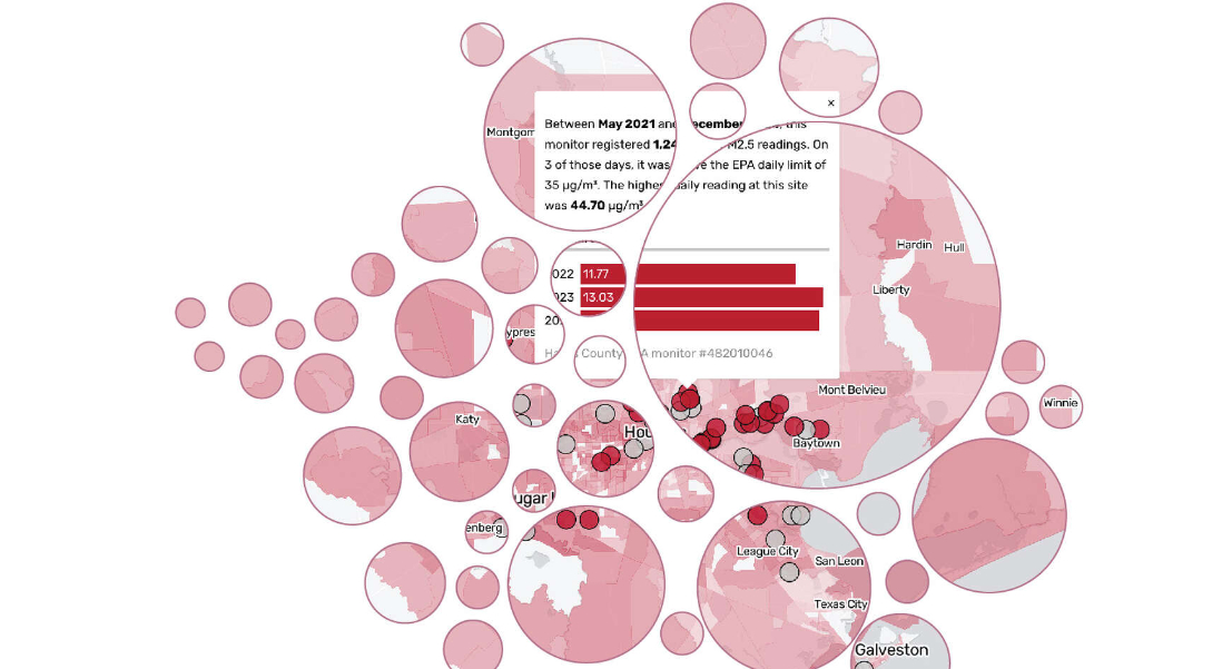
Dirty Air
A 3-story project looking at the data behind Houston's worsening air quality. I teamed up with environmental reporter Rebekah Ward to investigate air quality trends as reported by both state-regulated and community air monitors. I pulled data from the PurpleAir API, cleaned and processed it so it could be married with state-produced data. I also mapped data from the CDC to allow readers to explore connections between health outcomes and poor air quality.
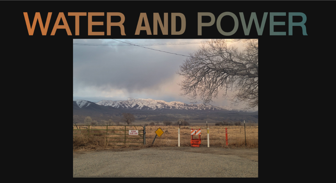
Water and Power
I worked with a talented editorial and design team to built the micro site for an AfroLA's series on the controversies surrounding Los Angeles Department of Water and Power's ownership of a substantial portion of Inyo County, CA. I built the site using Flask and Tailwind and incorporated component-based elements for easier updating down the line.
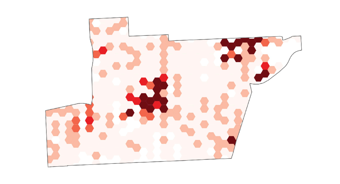
Houston neighborhood crime analysis
This story is part of an ongoing series with crime reporter Matt deGrood that looks at how crime is affecting Houston residents. Each story in the series looks at crime in a different neighborhood, focusing not only on overall crime counts but also at which crimes are most prominent in that community, how local trends differ from citywide trends and which areas of the neighborhood experience the most crime.
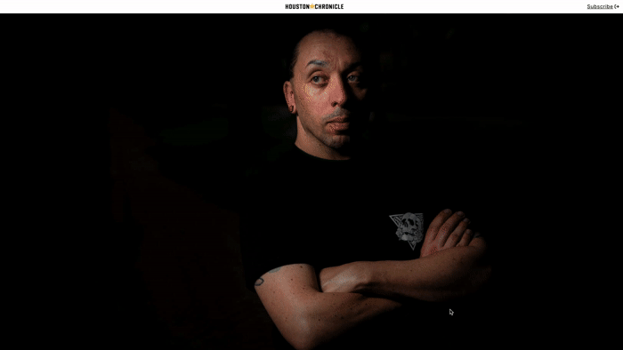
The Convictions of Jaysen Kettl
One of my greatest passions in journalism is bringing stories to life with design and development. This project is one of my favorites because I had an amazingly powerful and well-written story and phenomenal photography to work with. I particularly enjoyed navigating the sensitivity necessary for designing around these topics (school shooting, LGBTQ+, drag) for a Texas audience.
I used React to develop this site.
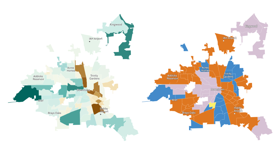
Neighborhood population change
Used custom mapping and analysis to estimate populations living in each of Houston's neighborhoods in both 2010 and 2020 in order to talk about how each neighborhood has changed over time.
Public Media Covid-19 Tracker
I've always valued collaboration for the depth and creativity it can bring to journalism. This project was a valuable collaboration across several NPR stations that allowed us to quickly develop scrapers and graphics to track the progression of the COIVD-19. In addition to case and death data, we pulled in data on at-risk populations to better contextualize outbreak risk. We also made efforts to open source this project to make it available for anyone to replicate for their own state.
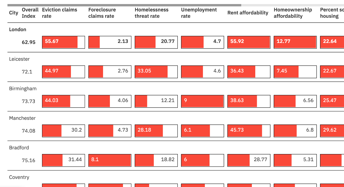
2020 Housing Security Indices
Helping readers understand crucial issues in their community through data and visuals has always been one of the most exciting things about data journalism for me. For this reader tool, I sourced and combined multiple datasets to produce city rankings on the health of local housing. The indices provided a starting point for several articles analyzing the most and least housing-secure cities. (Pardon the layout, the site has undergone a few revamps since 2020!)
2020 saw a historic decrease in traffic congestion, though not everywhere
IcCombined city-level data on traffic congestion patterns during COVID-19 with climate change mitigation reporting data to show that many cities with increased congestion during 2020 also do not publicly report mitigation goals.
Biden’s broadband plan comes at a pivotal moment for the digital divide
I used multiple internet speed and accessibility datasets to show that one of the US government’s primary sources for funding broadband expansion projects often overstates broadband access, especially in large cities.
Good River Website
I partnered with PublicSource creative director Natasha Vicens to design and build a website (using NPR Interactive Template) to feature stories and interactives for the Good River collaborative.
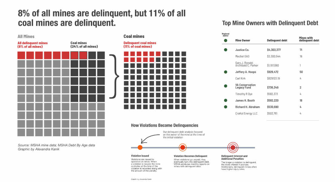
Mine Safety Debt Analysis
I partnered with reporter Brittany Patterson on an investigation that found West Virginina Governor Jim Justice owed millions in unpaid mine safety violations to the federal government. I also performed an extensive data analysis to look at characteristics surrounding the unpaid fines, like injury rates and production.
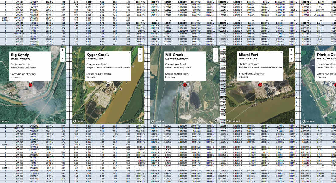
Coal Ash Pollution Analysis
I cleaned, processed and analyzed hundreds of pages of water testing data to understand how coal ash storage affects groundwater. I also created an interactive map for users to explore water contamination results at specific power plants.
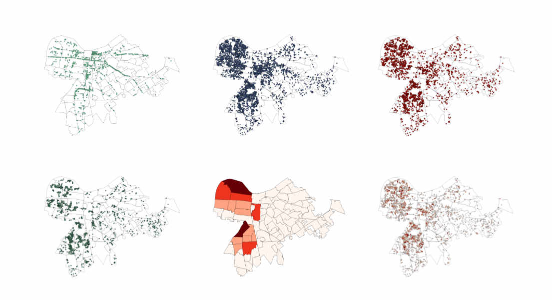
Trash and Poverty Analysis
I worked with reporter Jacob Ryan to investigate the intersection between income and availability of public trashcans. I combined 311 data with trash can location data to find areas plagued with trash but missing cans.
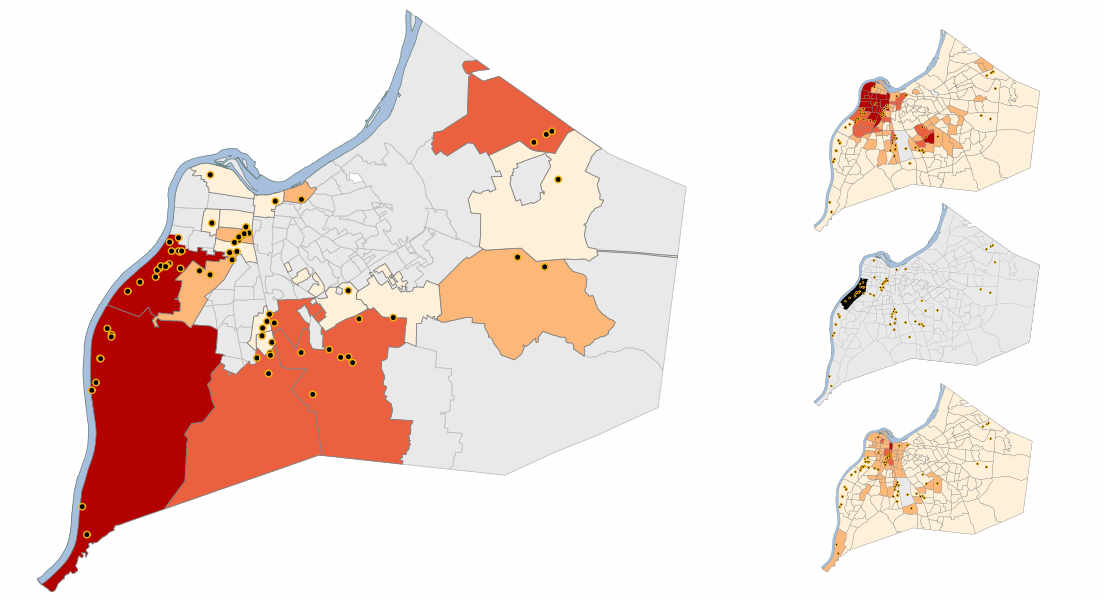
Air Quality Interactive Map
I analyzed EPA Toxic Release Inventory data to reveal the biggest air polluters in Louisville disproportionately affect lower-income and Black residents. I created an interactive map that would allow residents to input their address and receive a report of air pollutants near them.
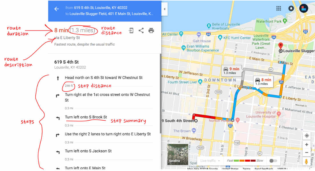
Transportation Variation Google Map Animation
I partnered with reporter Amina Elahi to talk about reduced public transit availability and its affect on employment opportunities for Lousiville residents without a car. I was able to create an interactive map using Google Maps API animate the difference in time commitments for car versus bus transportation across town.
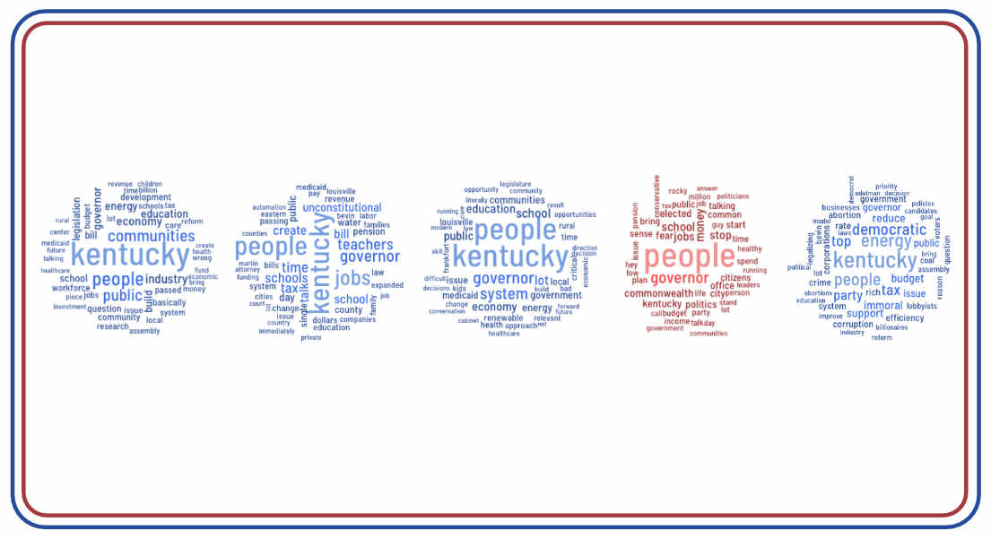
Kentucky Gubernatorial Candidate Text Analysis
I analyzed audio from interviews with 2019 Kentucky Gubernatorial candidates to get a sense of what candidate emphasized most when talking about a variety of issues important to voters.
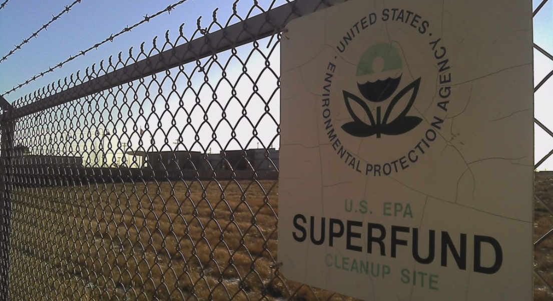
Superfund Flooding Analysis
I used AP data to illustrate potential hazards to Kentucky, Ohio and West Virginia residents living within one mile of superfund sites located in floodplains.